Colors are more than just visual elements; they have a profound effect on how we feel, think, and behave. The psychology of color in interior design is all about using shades to influence mood, energy, and perception of space. Whether you want a calming bedroom, a productive home office, or an inviting living room, choosing the right colors can completely transform your environment.
In this article, we’ll explore the science behind color psychology, how different shades impact emotions, and practical tips for applying these principles in your home to create spaces that feel intentional, vibrant, and harmonious.
Understanding Color Psychology
Why Colors Affect Mood
- Colors interact with our brains through light perception
- They trigger emotional and physiological responses
- Cultural and personal experiences shape color perception
Primary Effects of Color
- Warm colors: energetic, social, stimulating
- Cool colors: calming, relaxing, focused
- Neutral colors: balance, harmony, flexibility
Warm Colors and Their Impact
Red: Energy and Passion
- Stimulates appetite (great for kitchens or dining rooms)
- Evokes excitement, intensity, and attention
- Use sparingly to avoid overwhelming a space
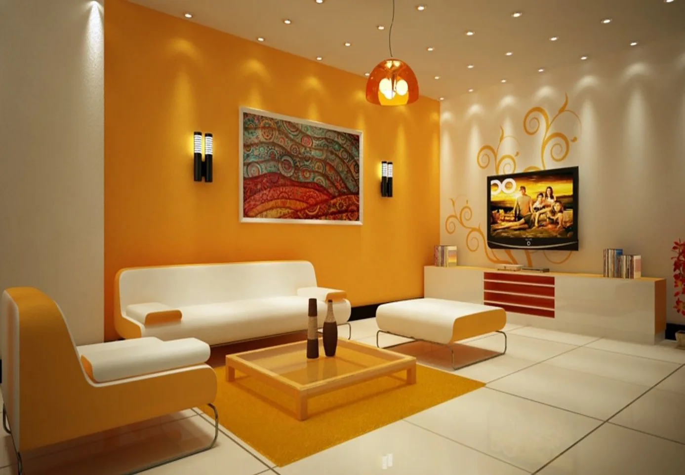
Orange: Creativity and Enthusiasm
- Encourages social interaction and playfulness
- Ideal for creative spaces or social areas
- Pair with neutrals to balance energy
Yellow: Happiness and Optimism
- Brightens spaces and enhances mood
- Perfect for kitchens, entryways, or sunrooms
- Overuse can create tension, so mix with softer tones
Cool Colors and Their Benefits
Blue: Calm and Focus
- Reduces stress, promotes relaxation
- Excellent for bedrooms, bathrooms, and workspaces
- Dark blues can add sophistication, light blues increase serenity
Green: Balance and Nature
- Evokes natural environments, promoting calm and renewal
- Works well in living rooms, bedrooms, or home offices
- Adds freshness without overpowering other design elements
Purple: Creativity and Luxury
- Encourages imagination and introspection
- Light lavender = calming, deep purple = elegance and luxury
- Suitable for bedrooms, reading nooks, or creative spaces
Neutral Colors: Flexibility and Harmony
White: Simplicity and Openness
- Creates a sense of space and cleanliness
- Ideal as a base for layering textures and accent colors
- Can feel sterile without warm accents
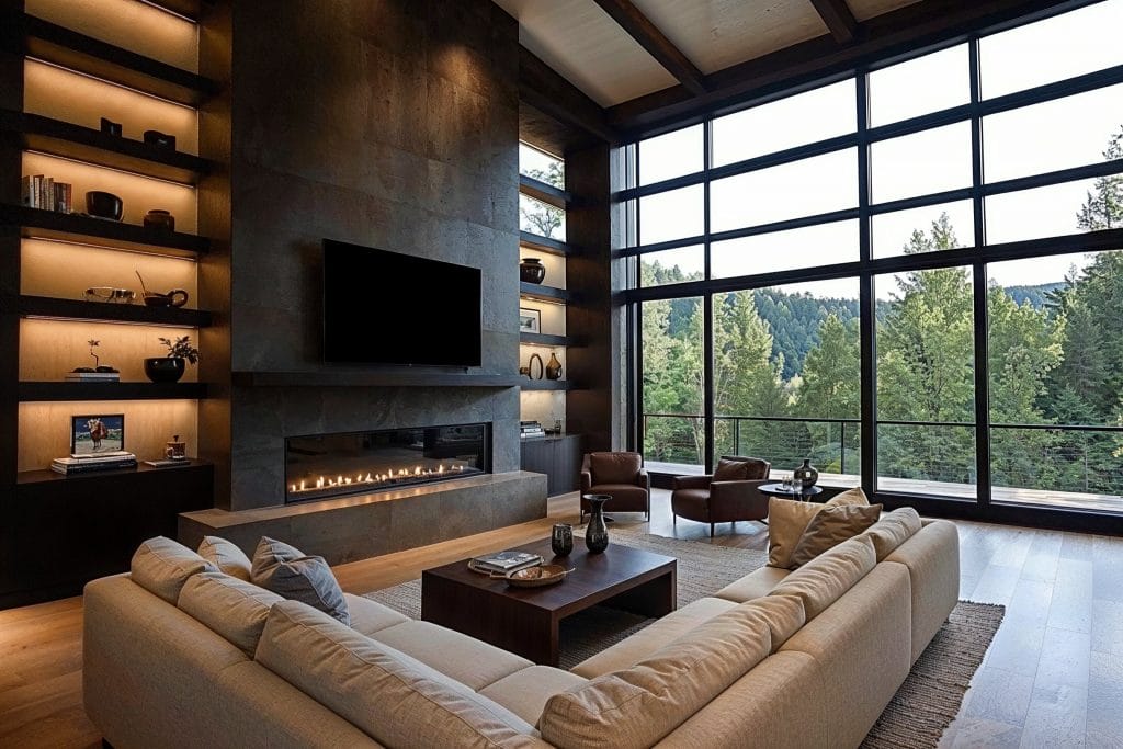
Gray: Balance and Sophistication
- Versatile background for modern and minimalist designs
- Pair with warm or bright accents to prevent coldness
- Works in living rooms, offices, and bedrooms
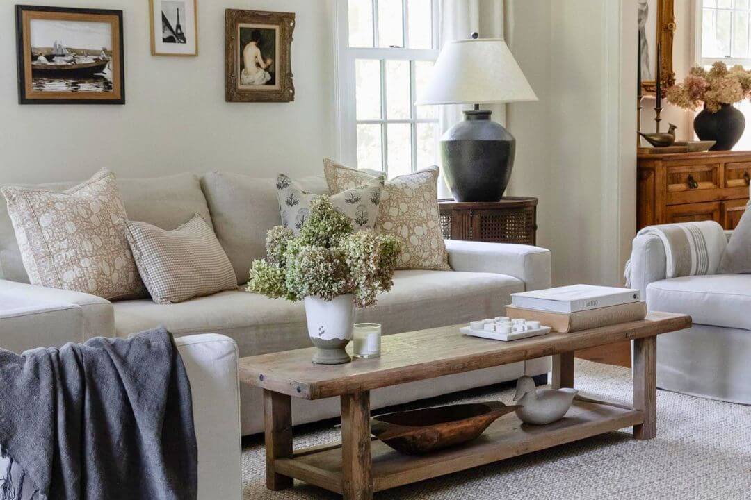
Beige and Taupe: Warmth and Comfort
- Neutral yet cozy
- Creates a calm and inviting environment
- Ideal for open living spaces
Accent Colors and Their Role
- Small doses of bright or contrasting colors can energize a room
- Accent walls, throw pillows, rugs, or decor items are cost-effective ways to experiment
- Helps maintain balance without overwhelming the senses
Color Placement and Room Function
Living Room
- Warm neutrals for sociability
- Pops of color in decor for vibrancy
- Avoid overly bright walls that dominate the space
Bedroom
- Cool, calming tones like blues, greens, or lavender
- Soft textures enhance comfort
- Neutral bases allow for versatile decor
Kitchen and Dining Area
- Warm colors (yellow, red, orange) stimulate appetite and conversation
- Use colorful accents like chairs, backsplashes, or small appliances
Home Office
- Blue or green promotes focus and calm
- Small pops of orange or yellow for creativity
- Avoid dark, heavy colors that reduce energy
Lighting and Color Interaction
- Natural light affects how colors appear throughout the day
- Artificial lighting (LED, warm, or cool bulbs) changes perception
- Always test paint swatches at different times of day
Color and Space Perception
Making Small Spaces Feel Bigger
- Light colors reflect light and create openness
- Soft blues, whites, and pastels enhance the feeling of space
Creating Cozy, Intimate Areas
- Darker shades make rooms feel warmer and more enclosed
- Ideal for reading corners or bedrooms
Patterns, Textures, and Layering Colors
- Combine textures and shades for depth
- Rugs, curtains, and cushions can introduce layered colors
- Patterns add personality without overwhelming minimalism
Color Trends vs. Timeless Choices
- Bold and trendy colors: add energy but may date quickly
- Timeless neutrals: provide flexibility and longevity
- Mix a base of neutral colors with seasonal accent updates
Budget-Friendly Ways to Apply Color Psychology
- Paint is inexpensive and transformative
- Accent pieces like pillows, rugs, and curtains allow seasonal changes
- DIY wall art or decals add personality
- Swap decor instead of full renovations for immediate impact
Color Psychology Tips for Every Home
- Start with a neutral base for versatility
- Identify the mood you want in each room
- Introduce accent colors strategically
- Use textures to complement shades
- Consider lighting, both natural and artificial
Conclusion
Color is a powerful tool in interior design, shaping how you feel in your home. Understanding color psychology allows you to design spaces that evoke the right emotions, enhance functionality, and reflect your personality. By strategically combining warm, cool, and neutral shades, you can create a balanced environment that’s both visually appealing and emotionally fulfilling. Whether you’re refreshing a single room or redesigning your entire home, mastering color psychology is the key to creating a space that truly feels like home.
FAQs
1. How do I choose the right colors for my home?
Consider the mood you want for each room, natural lighting, and existing furniture.
2. Can small color changes make a big difference?
Yes — accent pieces, cushions, rugs, and wall art can transform a space instantly.
3. Are there universal calming colors?
Blues, greens, and soft neutrals are generally calming and versatile.
4. How do I combine bold and neutral colors?
Use neutrals as a base and add bold colors as accents in small areas or decor items.
5. Can color affect productivity at home?
Yes — blue and green tones improve focus, while warm colors like orange can enhance creativity.